Introduction
Four Seasons RV Rentals is a RV rental division of Fraserway RV with various rental depots across Canada. This website serves as an informational website where they can showcase their rv rental products and service offerings for prospective RV renters.
The original website had outlived it's product lifecycle and needed a refresh in both updating the platform and modernizing the code.
This project served as an opportunity to push my creativity and skills, rework the brand and modernize the platform to better serve RV rental customers.
View WebsiteProject Duration
8 Weeks
Year
2019
Problem Statement
To modernized the brand and web experiences of Four Seasons RV Rental for both staff and customers so customers can make an informed decision before they book an RV.
Key Opportunities
- Not mobile responsive
- Required FTP access to update content
- No existing analytics
- Brand is being consolidated
My Role
- Product Manager
- Art Director
- Product Designer
- Web Developer
- Digital Marketer
Team Members
- Amanda Henschell - National Marketing Manager
- Phoenix Maclaren - Project Manager & Writer
- Gurjant Sekhon - Graphic Designer
Product Overview


Challenge
The primary challenge for this product was time and resources. In addition to the product needing to be completed before the start of the camping season. We were also tasked to consolidate the brand closer to Fraserway RV.
Since this product was being created in-house with very little budget, the team huddled and came up with the following solution.

Solution
Our first task was to identify the brand positioning that we wanted to take with Four Seasons. The decision was to remove the economy portion and introduce the tie in the Fraserway instead. We then took a look at the logo to see how we may take elements from the Fraserway logo to help bring it closer to Fraserway's logo.
The department wanted the brand to capture the fun atmosphere of renting RVs and the rental department, so I created 3 different art directions to help visualize the look. We ultimately went with the current brand elements of faceless vector art to allow the style to be flexible and have it juxtaposed it with real RV images. We took apart the design inside adobe cc library and created a design system to quickly compose new designs.
For the website, we opted to purchase a starter theme to reduce development time and modified it with some custom development. To satisfy specific business requirements, we used plug-in combinations such as custom post type and advanced custom fields to create custom data fields to make it easier for staff to populate the content.

Results
Overall the website was considered a success and was launched on time. The art direction was well-recieved and additional assets such as tire covers, physical signage continue to be utilized and expanded by the rental department today.
10%⬆
in User Growth YoY
Visitors from all over the world have visited and browsed the website before going through the booking engine.
20%⬆
in Site Performance
Mobile first development and increases across the board in Performance, Accessibility, Best Practices & SEO based on lighthouse performance reports.
500%⬆
in Staff Productivity
Successfully re-platformed to WordPress enabling others to update content and removing the need to manually update through FTP.
Visuals

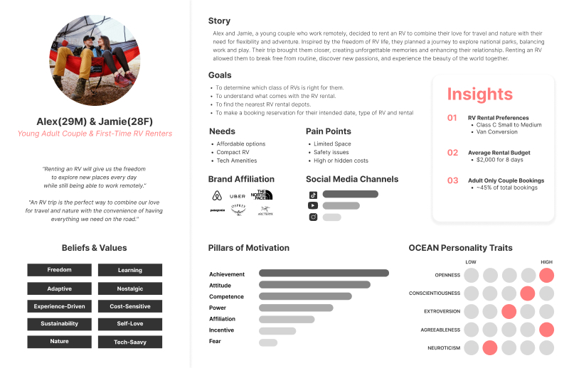
Persona 2

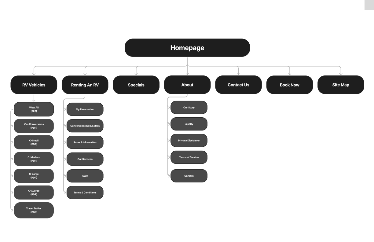
Information Architecture

Original Website in PHP

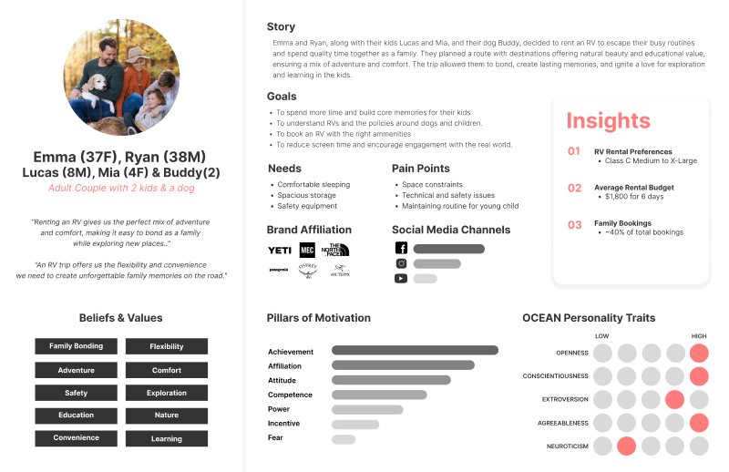
Persona 1

Persona 2
Process & Activities Overview
Research & Discovery
- Stakeholder Interviews
- Competitor Research
- Heuristic Evaluation
- Platform Research
- Product Strategy
↻
UX & UI Design
- Persona Development
- Information Architecture
- Wireframes
- High-Fidelity Mock-ups
↻
Web Development
- WordPress Setup
- Custom Development
↻
User & Systems Testing
- QA Testing
- User Acceptance Testing
- Smoke Testing
↻
Go-to-Market Strategy
- Brand Positioning
- Content Generation
- Google Tag Manager Setup
- Google Analytics Setup
- Custom Events
